Circle

The Idea
Accessible comprehensive social media platform that is easy to navigate and encourages both producer and consumer roles. The circle is available on multiple devices and allows elderly users to cultivate a sense of purpose and belonging in their later stages of life.
Work completed
App UI and UX Design, User Testing, User Research, Prototyping, Wireframing, Branding
The problem
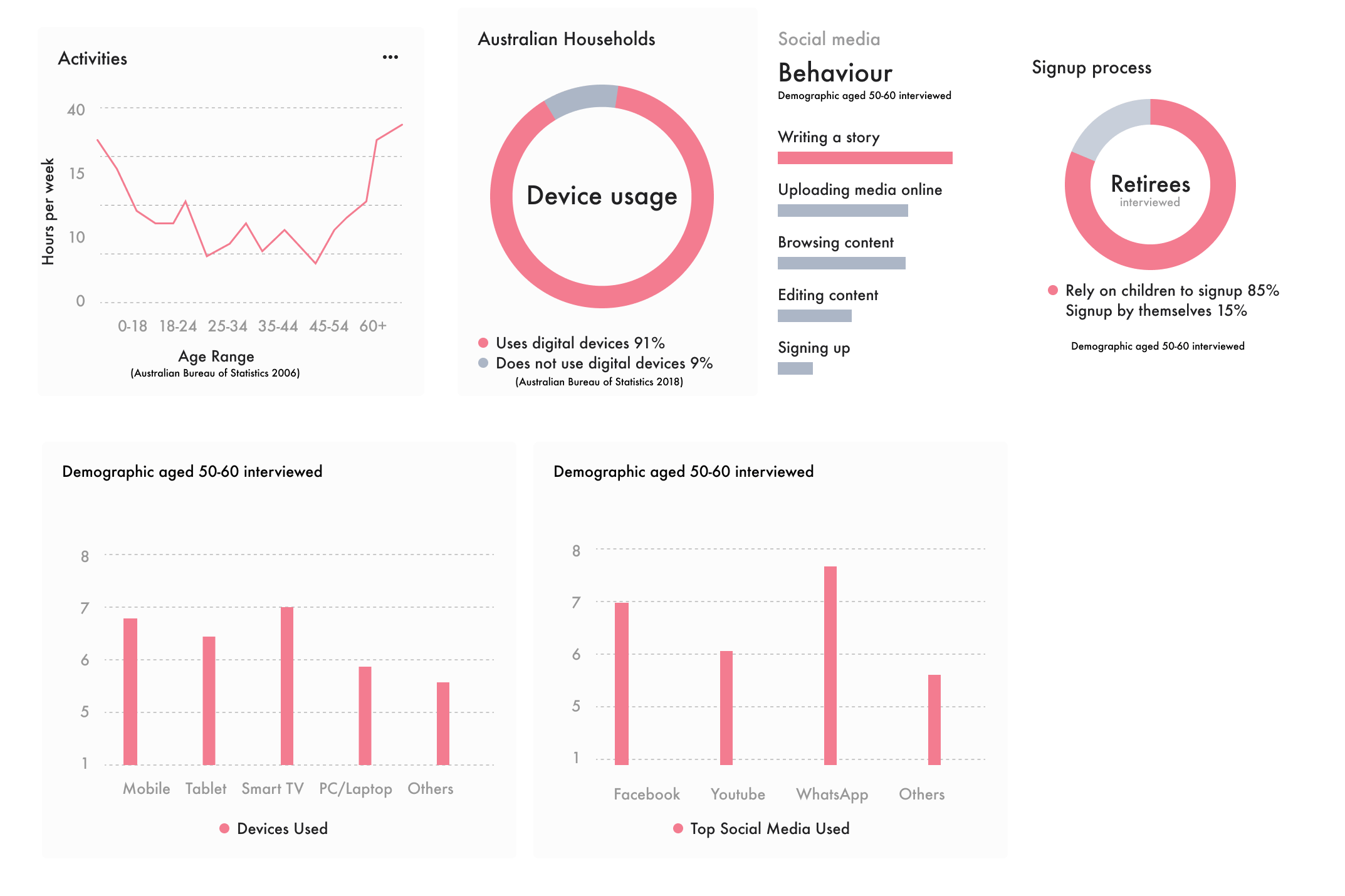
Seniors tend to experience drastic life changes and losses that are difficult to a grounded sense of community. Empty Nest syndrome at the end of their career and a real surge of down time can easily lead to feelings of anxiety, restlessness and isolation.
Additionally, technology can be intimidating, and unfamiliar as the options currently available don’t have retirees top of mind.
Key Features
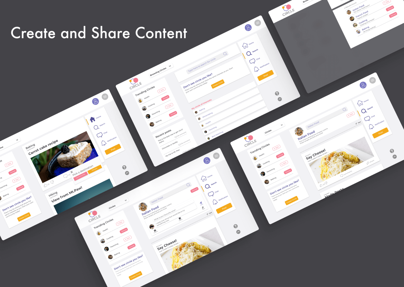
Circles
In app groups centered around common hobbies, interests or discussion topics.

Content Creation and consumption
Platforms such as Tiktok and youtube were found to be favoured by seniors as they are able to consume content tailored to them. However they primarily use facebook as producers creating posts and interactions with friends and family. Circle encourages both facets of social media, solving retirees need for community and purpose
Initial Research
We interviewed recently retired people and homemakers (housewives/househusbands) to understand their daily lives, hobbies, technology and social media usage, and their needs. In addition, we did more secondary research for Australians aged 55-65′ social trend and tech usage. Some patterns and key findings we discovered were:
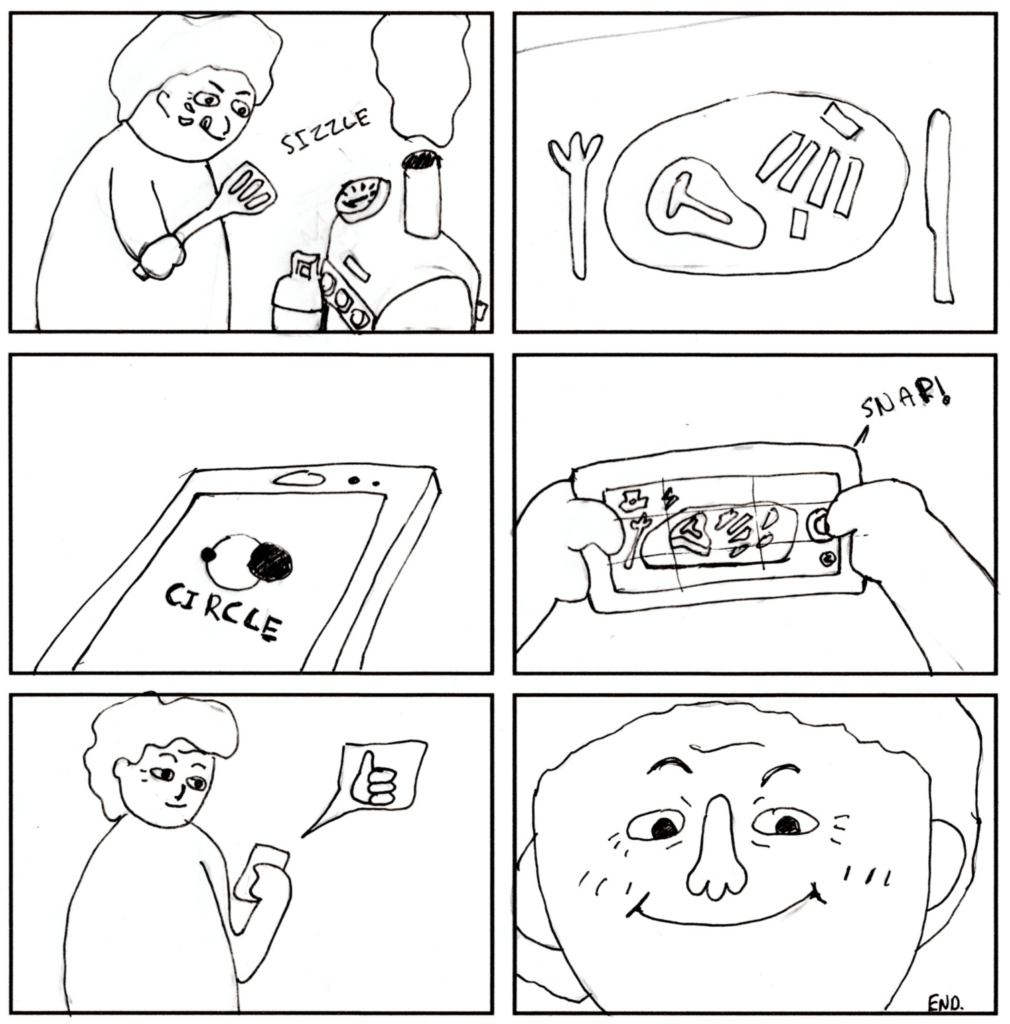
Scenario
The Circle user is a 60 year old retiree who has just finished cooking a meal for themselves at home. As they are part of the homecooking Circle they decide to take a photo of the disk and share it with the group members. The Simple of inviting interface results in a seamless experience with the mobile app and they start to receive likes, comments and attention for their action.
Goals
Functional Requirements:
- User Connectivity: Enable users to connect and stay in touch with others.
- Content Interaction: Support for liking and sharing content.
- User Accounts: Account creation and management.
- Content Uploading: Allow users to upload text and media.
- Content Filtering: Filter content based on relevance and user interests.
- Personalized Content: Deliver content tailored to users’ preferences.
- Search Functionality: Implement a search bar for easy navigation.
- Interest Groups (“Circles”): Create groups for various hobbies and interests.
Non-functional Requirements:
- Device Accessibility: Accessible across different devices.
- Typography and Clarity: Use clear text and appropriate typography.
- Search Engine Optimization (SEO): Easy to find on Google.
- User Experience: Easy to use, learn, and engaging.
- Reliability: Error-free operation.
- Privacy and Safety: Ensure user privacy and safety.
- Familiarity: Use familiar terms and concepts.
- Visual Appeal: Inviting, friendly, and lively design.
- Performance: Fast loading times.
- Efficiency: Minimize the number of steps required to complete tasks.
- Content Personalization: Tailor content to individual users.
Prototype and Testing
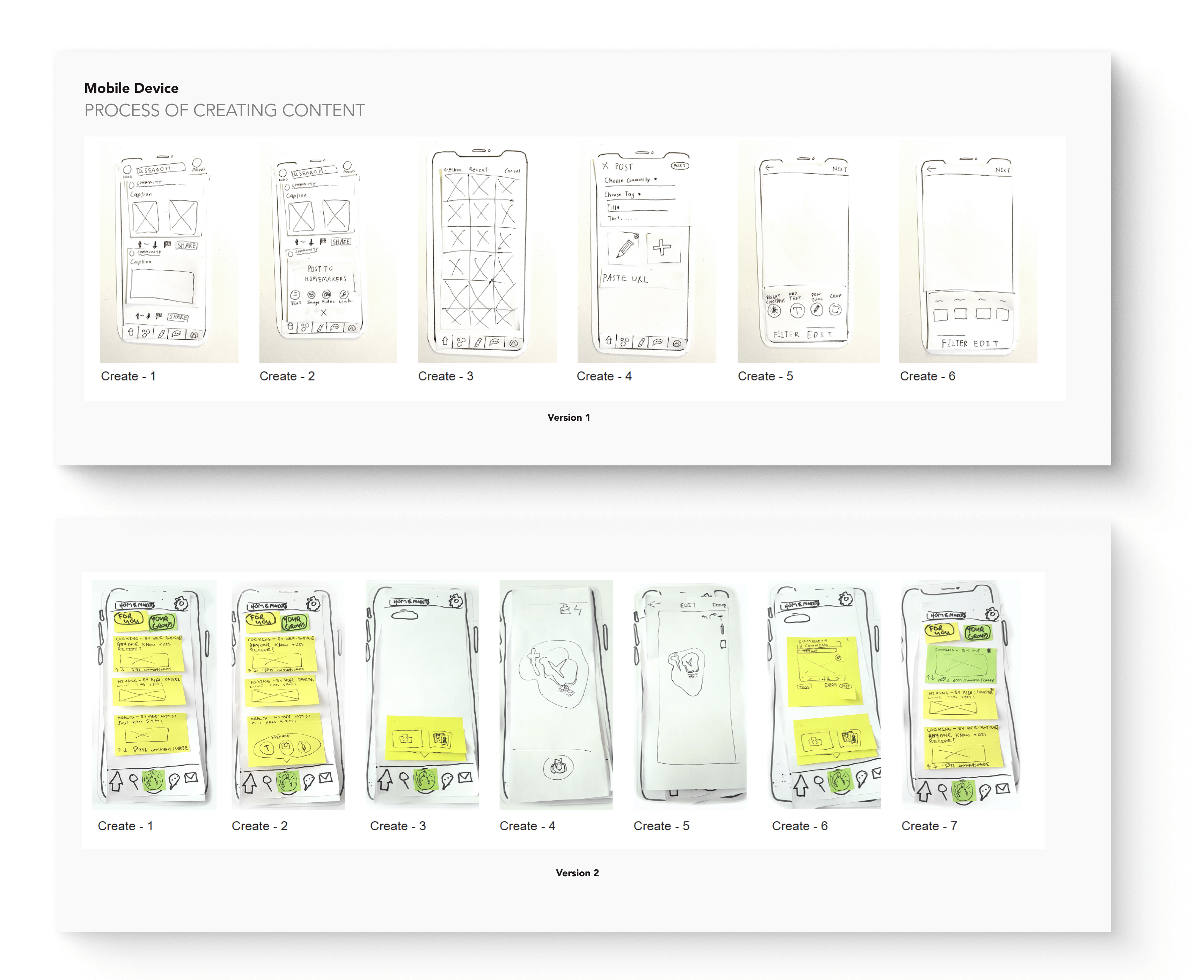
A/B Testing
Two concepts were developed as paper prototypes and tested on 10 participants who were tasked to complete particular tasks. They were then asked to come comment on their experiences.
Version 1
The platform’s environment was easy to adapt to, and most tasks were straightforward and consistent across all devices. Larger devices were preferred, as their elements were more readable. However, participants encountered confusion at certain stages and with some buttons.
Version 2
The layout was fairly consistent across devices, which enhanced the platform’s learnability. However, confusing icons and complex navigation posed challenges. Participants often found themselves stuck and struggled at certain points.
Test protocol and Post Evaulation Interviews
The high-fidelity user testing protocol aims to evaluate the platform’s usability across different devices and assess whether our target audience finds it easy and appealing after implementing changes from the initial testing phase. The session will capture both quantitative data (e.g., the number of users making similar errors, time taken to complete tasks) and qualitative insights (e.g., recorded sessions and transcripts of user interactions).
Participants will be asked to complete various tasks on one prototype device and then attempt to replicate those tasks on different devices. It’s emphasized that the focus is not on evaluating their performance but on understanding their rationale and actions throughout the process. After completing all tasks, a post-evaluation interview will be conducted to gather user feedback on what they liked, disliked, and any improvements they would suggest.

Heuristics
One of the valuable insights from the previous high-fidelity prototype was that some users found the text challenging to read on larger devices, primarily due to text size and color contrast. To address this, we utilized a contrast checker program, which revealed that the existing color scheme did not meet optimal wcag 2.1 accessibility standards. In response, we selected new colors, #504C94 and #4F4F4F, which significantly improved the contrast ratio while preserving the platform’s welcoming aesthetic. These color updates were applied to the finalized prototype, and additional enhancements, such as layout adjustments, were made to further improve readability and overall usability.
Branding
Brand should be welcoming and friendly therefore a modern sanserif font is uses reduce cognitive load and the colours selected are should rejuvenate the audience.